Hello, Taernians!
As we previously announced, we’re coming back to you with yet another report from the second edition of closed tests of the mobile version of Broken Ranks. Although we’re still working on it, we want you to know what is happening in our mobile workshop and we’re sure you want to know it, too. ;)
If you don’t follow us, THIS is what we mainly focused on during the recent testing sessions. You, on the other hand, could see characters with special icons above their heads during your everyday adventures. Yes, those were the players traveling the lands of BR on their phones and tablets. Curious what they thought about the experience? Read on!
Even before we unlocked the ability to log in to the live servers, the mobile version had to pass an exam on the test server. Our goal here was to minimize the risks related to the optimization for various phone models. At the beginning, the testers (mobile veterans and new users among them) were given the task to create a new character, and simply play and do things players normally do in Trentis and its surroundings for a couple of days.
It needs to be said that some of them were especially dedicated and, despite the small window of time, achieved quite good results. We’d like to congratulate them here!
This part of the tests also allowed us to evaluate how the app functions at the beginning of the journey in Broken Ranks, meaning everything a new player faces - from registration, through character creation, to the prologue and the game itself. The whole process went well and the number of bugs reported was low. The testers also drew our attention to elements that could prove too complicated and unintuitive to new players thus giving us a lot of valuable feedback and suggestions. We’ll make sure to revisit these elements so that players starting their adventure with the game on mobile devices are fully satisfied.
Once we made sure nothing exploded and the game was optimized enough, we concluded this part of the tests with a party in Billy’s village. ;)
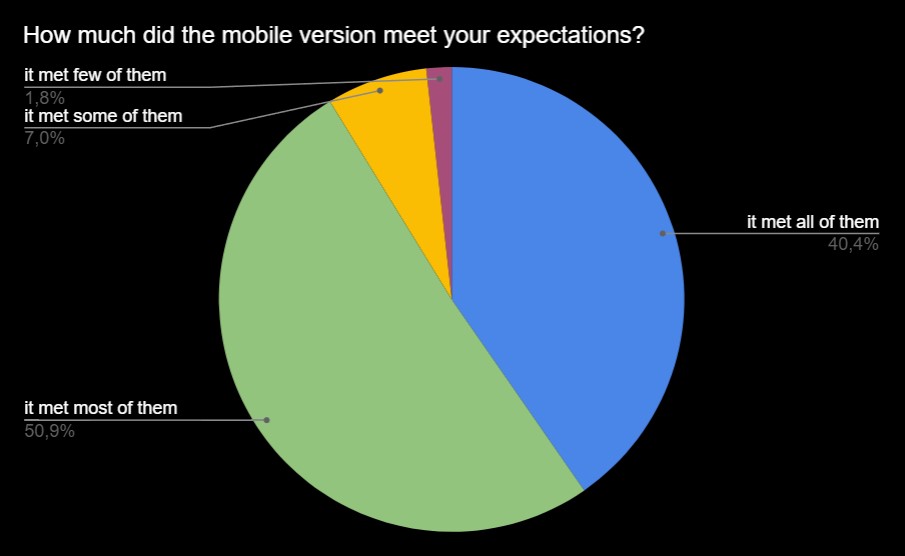
After the success of the first part of the tests, there was nothing left for us to do but to begin testing on normal servers. Starting on August 1st, our testing group with the addition of a couple of people (every tester could invite one of their friends) could begin playing on their own characters. From this moment and for the next 12 days, you could meet them all across the game world on any server. The mobile version passed this most important exam as is reflected by the impressions of our testers. Let’s get to business then.
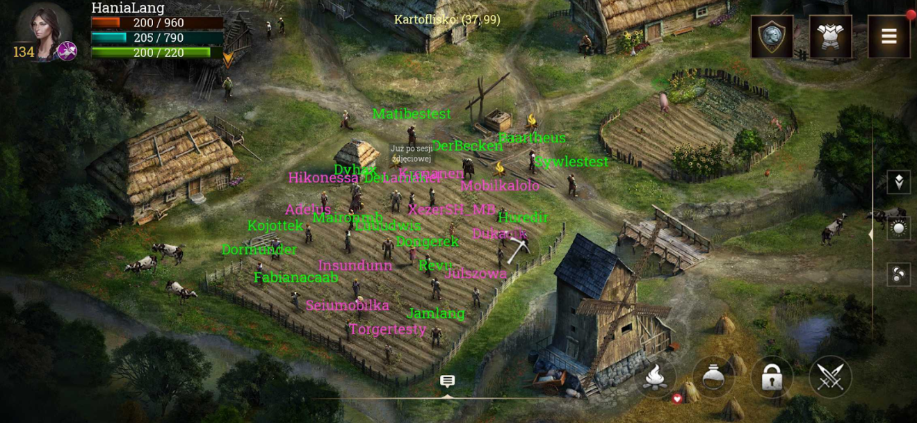
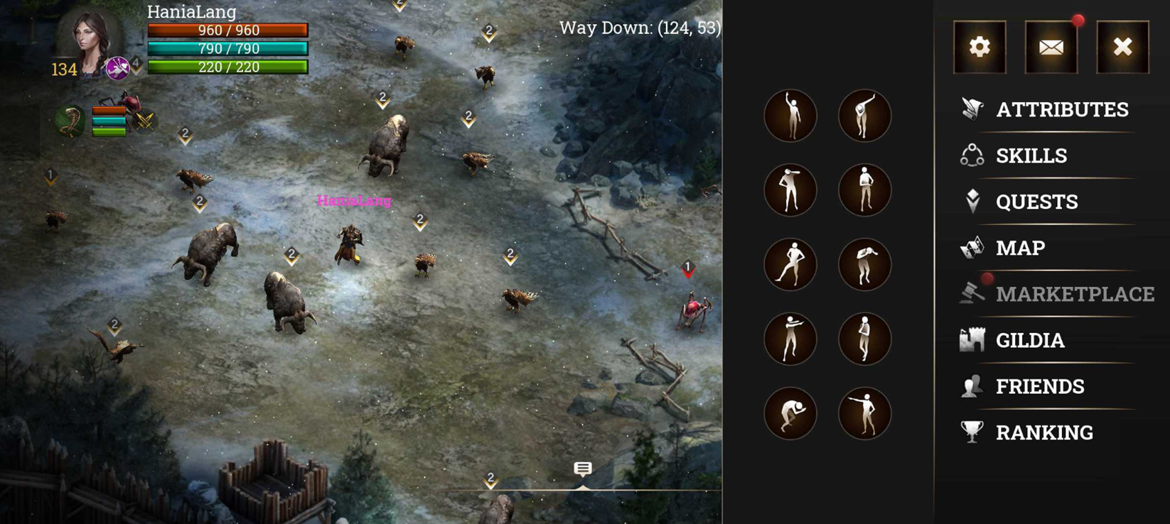
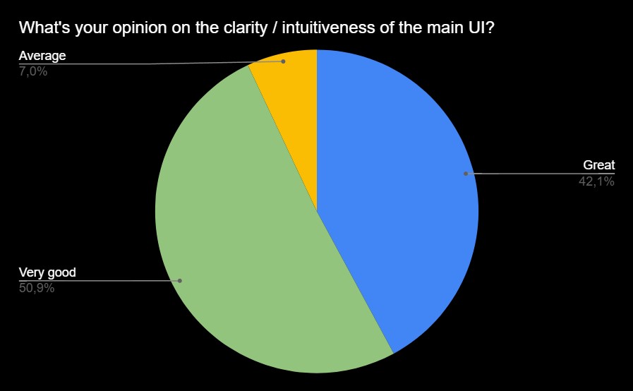
One of the elements the testers paid special attention to was the main UI, which was constructed from scratch with the mobile version in mind. We changed not only the placement of various icons but also the functionality of the chat, side menu, and dialogues. As tester opinions show, we hit the jackpot with those changes and the low marks were a result of the mobile version lacking some inherent game elements, e.g. the marketplace, chat being less comfortable, or low visibility of some elements, e.g. nicks of other characters on the map. Worry not! Before the release, we’ll introduce whatever we currently lack and smoothen any wrinkles!
I expected a lot of bugs and no play comfort but I was very pleasantly surprised.
To be honest, I was pleasantly surprised that the mobile version perfectly reflects what the PC version is. Killing bosses doesn’t require much training, doing tasks is also nice. Just give us the marketplace and guild maps, and it’ll all be great :)
Easy combat, simple controls, you can play anywhere you want, e.g. on a train/at university/at work, you can log in at any point to check what is going on or to help friends or your guild.
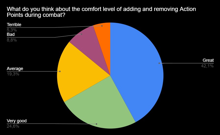
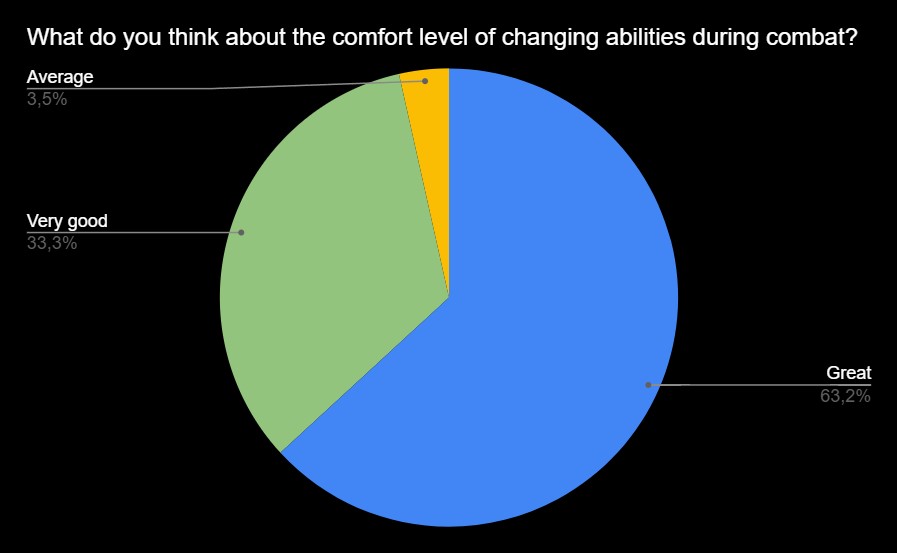
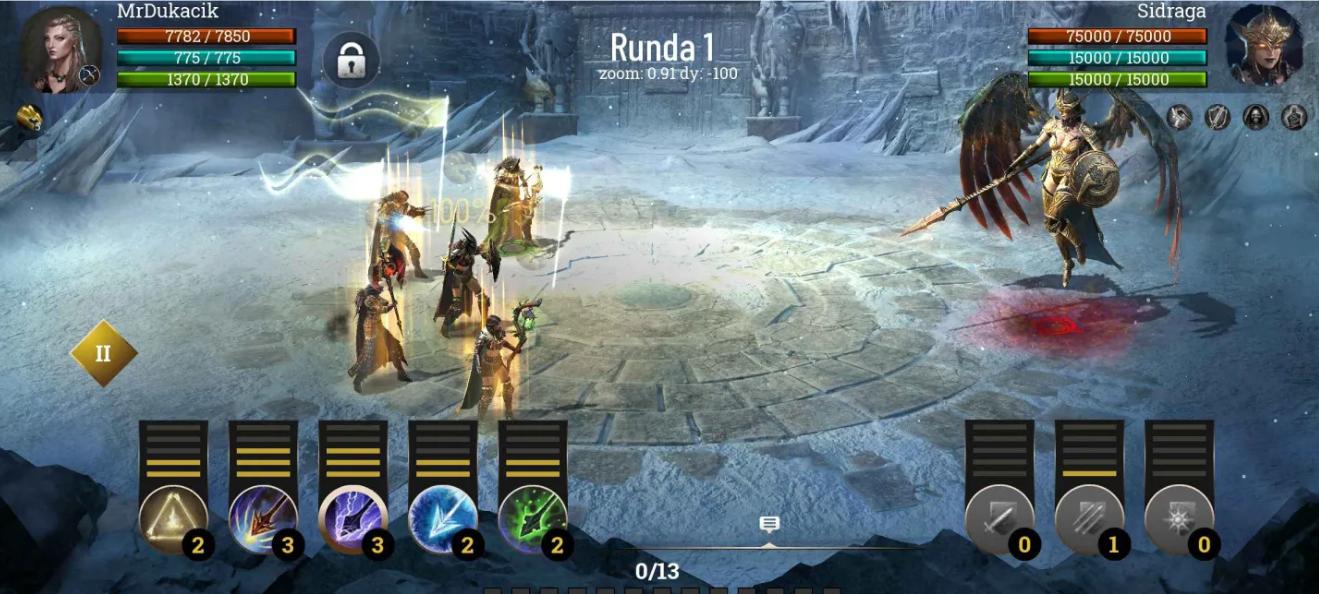
The combat UI was also altered in a couple of ways. Based on the results of the previous tests, we chose to further develop only one of the three modes, the one with the working name SWIPE. We focused mostly on its play comfort and added some solutions and gestures which made combat easier and allowed you to react quickly. After this round of testing, we’re glad to hear that the opinions of our testers confirm that everything is going in the right direction.
The current system of switching skills makes it possible to do this quickly. Thanks to this, even when the clock starts ticking, you can switch them quickly and not waste too much time, you can do it even faster than on PC.
Let me begin by stating that these are the first tests I’m in. I must say that I was pleasantly surprised with the quality of the game. The combat system is intuitive. I have no reservations about its intuitiveness.
It’s worth mentioning that we depend not only on numbers but also on the experiences of players who defeated even the strongest opponents on the mobile version! Congratulations (we hope the boss dropped something great)!
At first, I was worried that I wouldn’t be able to keep up when playing in a party, e.g. click the tactics and clock before damage-dealers (I was playing a debuffer) and the other players would be mad at me but after the first fight in a party all my worries were gone.
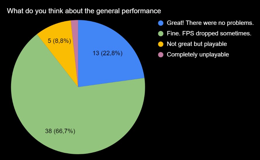
It’s worth noting that the optimization and performance aspects of the mobile version went through a true baptism of fire, because during the tests we had two events that were very resource intensive. We had some teething trouble but these were quickly overcome and further testing continued without any major disturbances for our testers.
We should say here that our testers used a wide variety of phones with vastly different parameters, from latest devices to those released as far as 8 years ago. All our testers managed to successfully launch the game and play. Their playstyles differed but none of them experienced major or recurring performance issues on most phone models not only after a dozen minutes but also after 2-3 or even 5 hours. The issues that were reported concerned mostly older models with low memory (below 3GB RAM) and occurred mostly in situations when the app was put under much more stress than in a testing environment, e.g. when there were many players or mobs around.
These tests surely weren’t the last. We continue to add new improvements and bugfixes, and we’ll certainly give them to our testers to check, so you’re bound to meet each other in the game world or go on an adventure together again.
You’re probably asking yourselves right now: it’s all fine and dandy but what next? When’s the release? There are still a couple of steps we need to take before we can announce the release date:
- adding elements that are missing but essential: e.g. marketplace, tutorials, equipment window,
- fixing all the bugs reported during the recent tests,
- optimizing game elements that caused performance issues during tests,
- adjusting the appearance and features of the new UI,
- perfecting controls and interactions on the map,
- implementing payments, premium store, and skin store,
- optimizing and testing the mobile tutorials on completely new players,
- testing the app on a wide range of players in order to catch technical issues on atypical devices.
You could say that we’re in the home stretch. However, there are still some features that we need to add and whose implementation time is hard to gauge. That’s why we’re not able to give you a final release date that wouldn’t be in danger of being pushed back. We’ll surely keep informing you about the progress so you can look forward to more articles!


