Hello, Taernians!
The work on the long-awaited mobile version is gaining momentum. The first, closed tests are already behind us. They were conducted by our testers, devteam members, and players who signed up for them during this year’s TaernCon. What happened? What were their first impressions? You’ll find out below ;)
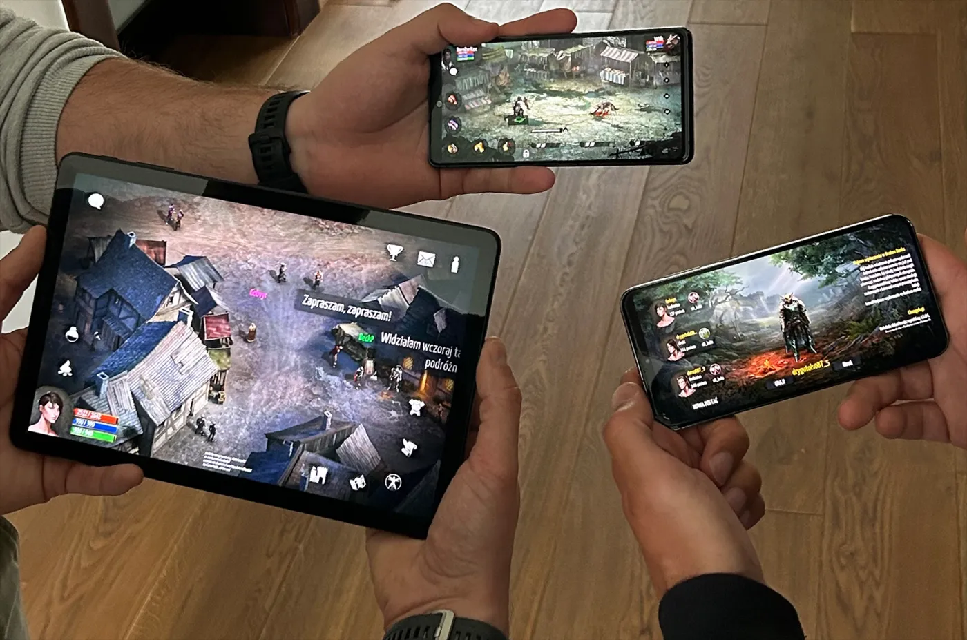
For three days, the lucky few were traveling across Haligard and beyond, leveling up on mobile. During the tests, we focused mostly on the usability of the main UI, especially character movement and interactions with the game world. We were also closely watching for optimization issues and how the game performed on various devices.
Our testers did a hell of a job and gave us vast amounts of constructive feedback. Thanks to their support and level of involvement, we gathered a lot of data that will help us improve the performance of the game.
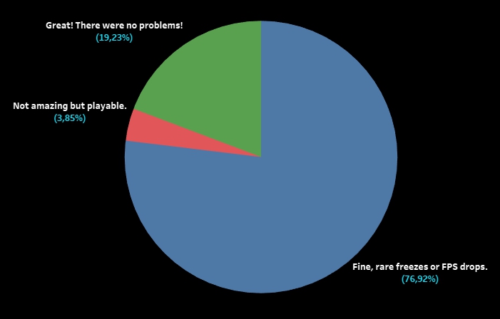
Is the mobile version playable? What about the fluidity and performance of this version? To answer these questions, we would like to show you the evaluations of our testers from the surveys we gave them. They are in the chart below. As you can see, the mobile version is quite playable now (the survey also included an option that said that BR was completely unplayable - however, this situation didn’t happen to any of our testers). To give you an interesting tidbit, you could enjoy Broken Ranks even on a six-year-old Huawei Mate 10 Lite (for those curious about the technical specifications of the phone: 4 GB RAM, Kirin 659 processor, and Mali-T830 MP2 GPU). Our testers also checked in what situations BR needs more RAM than their phones are able to provide (among the devices used, there were also those with only 3 GB RAM) and what graphics settings worked best.
Thank you once again for taking part in the tests!
What about the mobile version itself? It was quite well-received and the testers emphasized that, despite the early development phase and lack of some features, they could play comfortably.
“Apart from some technical difficulties, the gameplay was smooth and enjoyable. I think that if all the features are implemented, the game will be really fun.”
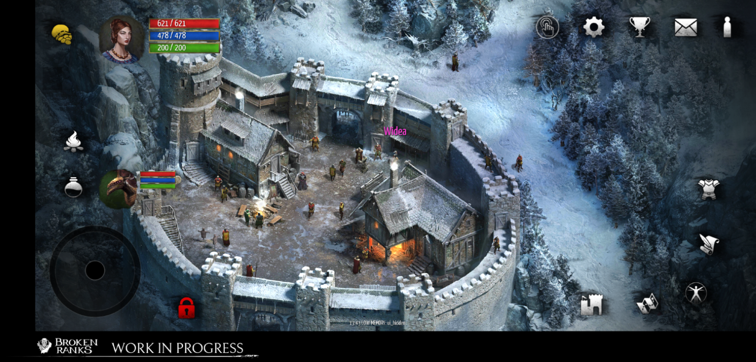
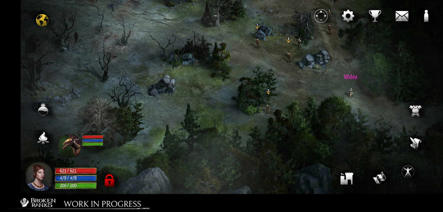
One of the biggest challenges when preparing the mobile version is designing the main UI. Attributes, equipment, chat - these are only a couple of useful things it’s good to have on hand when playing. There’s also the map where the character, NPCs, and other players move. As you know, the screens of mobile devices aren’t too big. Despite this, the version prepared by us was met with a warm welcome and the testers were really surprised how intuitive and user-friendly the UI was.
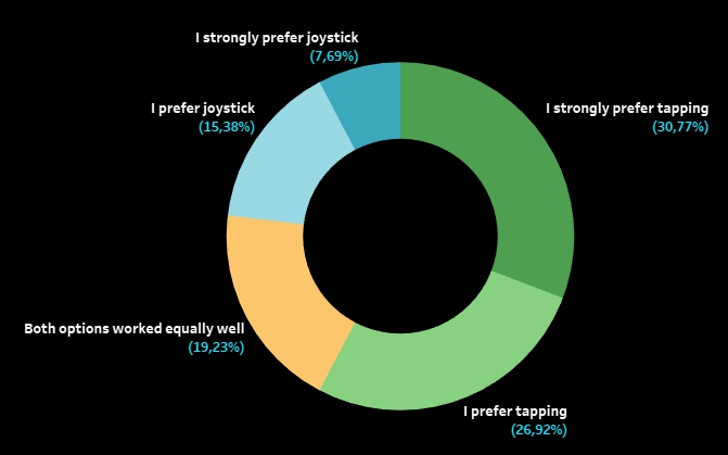
The controls were a real novelty. On mobile screens, you can move your character using one of the two ways: with traditional screen tapping or using a joystick. After three days of playing, neither we nor the testers could tell if one of them was strictly better. Both proved to be comfortable and shined in different situations. As you know, it’s all about the preferences. Our testers generally favored tapping but there were also many joystick fans. On the other hand, our dev team liked the joystick more. So many people, so many opinions, right? ;)
Until the end of the closed tests, we’ll leave both movement options in and we’ll keep improving them based on the feedback we get. We want to take into account the preferences of both our veterans and new players.
The tests allowed us to create a list of issues with both movement options. It includes everyday elements of the game like talking to NPCs or picking up chests. Of course, we’ll keep on improving so that you can travel the world of Broken Ranks as intuitively as possible on mobile devices.
However, the game is not just icons, it’s mostly combat, blood, and tears. During the tests, our players faced many a foe - from the dogs in Trentis, through champions, to bosses. And yes, you can fight quite comfortably despite the fact our testers had only the prototype UI at their disposal.
The next, big challenge is improving the combat screen so that all required information and icons are visible, readable, and don’t obscure players and mobs. After all, we need some space for choosing abilities and assigning action points. Of course, all of these elements need to be on hand (or, in this case, on finger) to let you quickly modify your strategy. How to do it so that it conforms with players preferences, various playstyles and, at the same time, is comfortable and intuitive? We have a lot of ideas and designs. After long deliberations, we chose two options (known under the working names “symmetrical” and “left-handed”) that best meet the above requirements. Soon, they’ll undergo testing and evaluation to tell which one (or maybe both) offers the possibilities closest to what the PC version provides, no matter if you’re facing a rat or Sidraga.
However, combat isn’t everything. Quests, tasks, exploration, gear upgrades, talking to friends - these elements have also been assessed. We received a lot of feedback about all the tested content and we know what the testers liked. And we also know very well what they disliked. ;)
Of course, there were a couple of big and small bugs, but that’s why we’re testing. One thing is sure - we have a lot to work on if we are to give you a fully functional mobile version of Broken Ranks.
So from now on, we’ll focus on fixing various bugs and issues while also implementing all the missing features.
In the meantime, you can expect more news from the mobile front, because the next portion of the closed tests will take place in December. This time, combat will be the focus. The same group of people will be invited to participate as we want to gather feedback from those who know Broken Ranks through and through and who, in such a short timespan, will be able to give us as much information as possible about the issues with the interface under extreme conditions (in situations which a “fresh” player of Broken Ranks wouldn’t be able to handle).
We’ll be testing combat in a party and solo both at the beginning of the game and in the endgame. Moreover, as we mentioned earlier, we prepared two types of controls, so every scenario will need to be tested twice, using each of them. The task of the testers will be to evaluate both control options to say how comfortable and fast they are. Their opinion will help us make the decision on which of the tested variants works better and allows for a more comfortable and effective combat in the mobile version.
Thanks to the gathered data and feedback, we’ll be able to prepare for the next phase of the tests which will take place in the first half of 2024. They’ll involve more people from both player groups (those who have never played Broken Ranks and those familiar with the game). During the tests, we will focus mostly on the early stages of the game and the issues encountered during initial contact with BR on mobile devices.
What happens next? There’s still a lot of work ahead of us - not only things related to content, features, mobile-friendly UI, or optimization but also time-consuming research of markets and target groups. In addition to that, there’ll likely be many more testing sessions so that we can be sure the changes we make are a step in the right direction. Cross your fingers and stay with us!
Stay with us! Adventure awaits!


